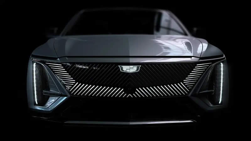
Cadillac has a new minimalist, black and white logo that will showcase the automaker’s electric vehicles.
There was a time when automakers really devoted themselves to developing the logo, fancy colors, italic fonts, or vintage-inspired symbols – but not anymore. Cadillac has shortened its logo to indicate the electric future ahead. The logo will now be completely black and white.
The American luxury car manufacturer Cadillac is already displaying this logo on its website and social media, and a backlit version has been released for the Lyriq electric prototype. The Lyriq will then be the first Cadillac to sport the new logo.
Cadillac isn’t the only automaker to switch to a more minimalist logo lately. Kia, Volkswagen, and Volvo have all made moves in this direction. This is a departure from the old, flamboyant-looking logos that are reminiscent of the classic Art Deco aesthetic appropriate to a luxury brand.
In 2014, the automaker made the first major change in its logo when it separated ornaments like tiaras and laurel wreaths, leaving behind a chrome, yellow, red, and black badge that, without needing to much, hints at Cadillac’s legacy. Now that color is gone with this new logo. In its place, there is a monochrome badge.
The colored coat of arms is not yet retired. A Cadillac spokesman told Fox News Auto that the new internal combustion engine cars will keep their colors, adding, “Our new crest and slogan ‘Be Iconic’ represents Cadillac’s desire to make each of our champions dream big and be the most inspirational version. . from ourselves.”
Cadillac confirmed earlier this year that all new production models will be electric by 2030.

